Identify a Font

Description:
This tutorial will cover a few ways to identify and track down a font. This is essential if you want to create logos from scratch. Especially when there is no high quality source available to use.
There are many sites available that will try to match a font by an uploaded image, but they all require that the image has a high contrast between the letters and the background. Sometimes this isn’t a problem and you can find a sample of clear black text on a white background, and you only have to worry if the different sites can identify it. Other times. this can require a good bit of prep work to adjust the image into something the sites can use. The better the sample you can upload, the better chance you will have in identifying the font accurately.
This leads to yet another decision. When is it better to just trace out the letters yourself instead of using the original font? Unfortunately this isn’t an easy question to answer and you should weigh your skill level against the quality of image you want to produce. If you are skilled in rendering using the path tool, it may just be easier to trace out the logo and not worry about using the original font. The other thing to weigh, is if you might actually already own the font or be able to buy it if isn’t a free font. There are many fonts out there that have free alternatives that are almost identical, but you won’t know that until you know what font you need.
As you can see, there are many factors to consider, but that will be left up to the user to decide. This guide will cover how to actually identify the font, and will also show you a way to use the raster samples provided by the sites to help create your logo.
Step 1. Find the best sample you can.
Your best bet is to use Google Image Search to find the highest resolution image of the logo. Preferably on a high contrasting background.
Step 2. Prepare you image.
This can be extremely easy or extremely hard, depending on the image. Different site have different requirements on how the image should be prepared. I find it easiest to prepare the image so it will work at any site, instead of having to change it if no match is found on the first site you try. but you can adapt any strategy you like.
I picked a movie from the incomplete movie list on the site for an example.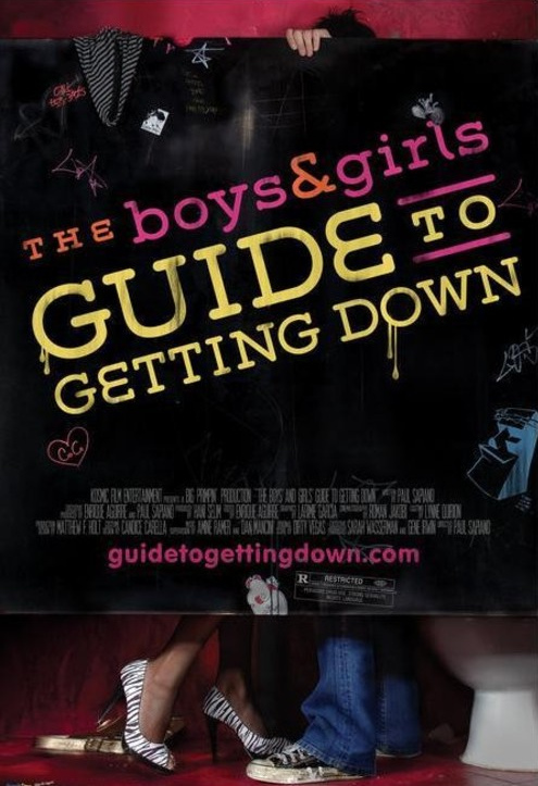
This example needs some work before submitting it. First I will rotate and crop the image.
Then I will desaturate the color. Removing the color from a sample image will help us to get the high contrast we need.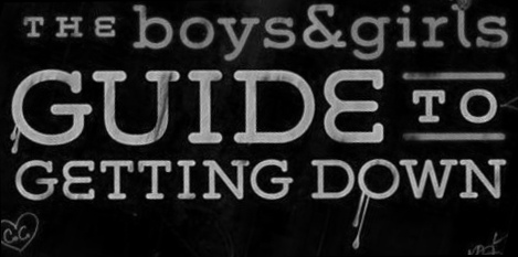
Next I am going to try and just submit the largest letters for my first try. I could also have tried to isolate the “Getting Down” text which would give me more letters to try and match, but if my first attempt doesn’t work, that is exactly what I would try next.
The last steps included adjusting the levels to get even more contrast, painting over the drips on the “G”, manually touching up any little spots inside the letters that weren’t removed with the level adjustment, and then inverting the color.
If you are able to make all your submissions look similar to this, you should have no problems using it on any site and it will give you the best chance to find a match.
Step 3. Submit Font Sample to sites
Now that we have our font sample, it’s time to submit it. I chose WhatFontIs as my first stop. It seems to have the best matching algorithm and always gives 100 results. You can even filter the results to show only free or free alternative fonts. There are lots of features to explore and they add new features frequently, so make sure to read about all the options. For now, I will just cover the basics.
1. Upload your font sample.
2. Specify white on black, or black on white.
3. Set any other options as you see fit.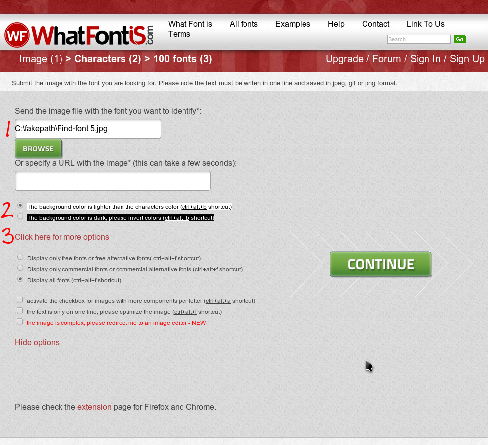
4. Once you submit your options, you will be presented with a page where you have to identify each letter. Make sure to match the capitalization properly.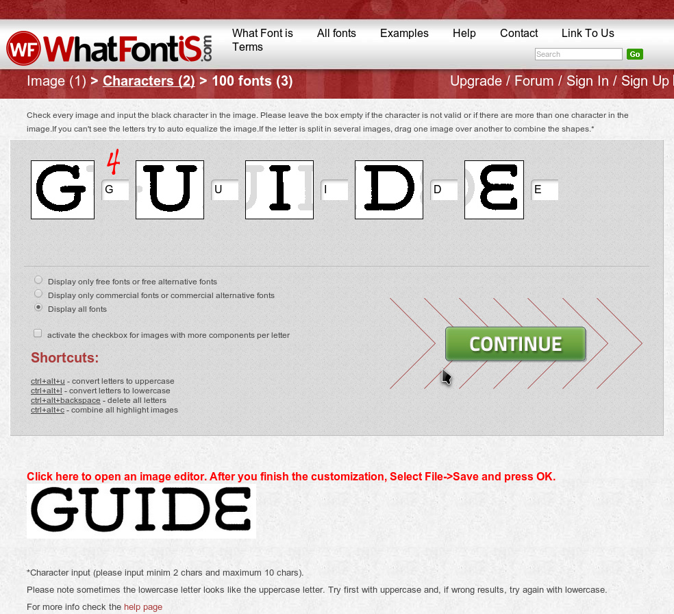
That’s it!
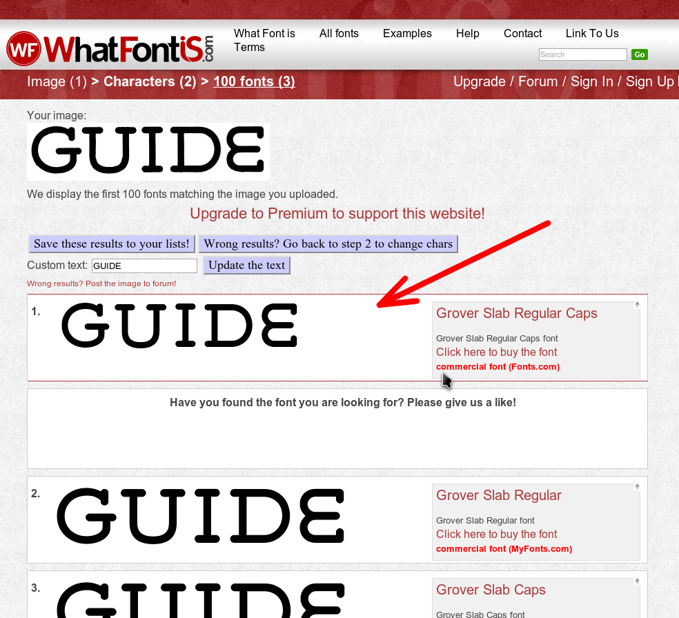
Now you will be presented with the results. In this case, the match is the very first result, but this isn’t always the case. Make sure to scour the results if it isn’t one of the first. I have found my match plenty of times down in the 80s or even 90s.
If you didn’t find a match here, it may be that your sample could use some work. Before you try to go back and refine it, you should try it on the WhatTheFont page on the MyFonts website. It works pretty much the same but has some subtle differences.
1. Upload your font sample.
2. Verify that the characters that MyFonts filled in are correct and make any changes as necessary.
That’s it!
Hopefully one of the few results is a match.
Lastly, you can try yet another font matching site if neither of those worked.
I am not very familiar with this site, but my first try didn’t produce a match. So I would certainly use this as my 3rd choice.
(Optional) Step 4. Use the raster results to build your logo.
Well you managed to identify your font but you neither own it, and you can’t locate a suitable free alternative. This technique will allow you to have nice crisp letters to build your logo with, but they will be raster images, which means they won’t upsize well. We need to keep this in mind when creating our logo.
There is also a second option to build your logo with these raster samples and then using a vector program like Illustrator or Inkscape, to convert these crisp images into paths. It’s up to you to decide which “Path” to take. (pun intended) I will be explaining the first option.
You can find information on hand tracing logos in our tutorial section if you want to go that way.
GIMP HDLOGO
IMAGE TRACE A LOGO WITH ILLUSTRATOR CS6
THE ANIMAL LOGO TUTORIAL
GIMP FROM SCRATCH – PART 4 (INTRO TO PATHS AND CREATE HDCLEARLOGO)
Plan your attack!
To go this route, there are many things to consider. The most important is to plan it so you don’t have to upsize any letters. To achieve this, we must first create our logo with the low res sample so we can see how big the letters need to be. If this isn’t making sense yet, don’t worry. It should become clear soon.
We would start by taking our bad sample and crop it exactly to the edges of the letters so there are no extra pixels to the top, bottom, left, or right. The letters should touch each edge exactly. Once this is done, we will upsize it to be the correct size for an HDLogo. So if the text is taller than wide, we would upsize it to 290px tall. (Making sure to keep the aspect ratio locked.) If the text is wider than tall, we would upsize it to 780px wide. Now we will resize our canvas to the size of an HDLogo. (800px x 310px) Make sure the result is centered on the canvas and you should end up with something like this.
Now we can see just how big each letter needs to be in it’s final size. Since this logo is 3 lines of text, the text isn’t going to be very big. I will show you later how this could be a problem if the letters were very big.
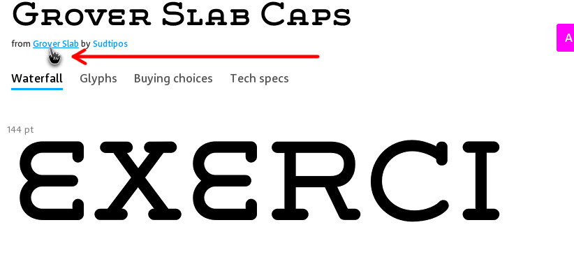
Now that we have the information we need, we can proceed to create our text on MyFonts site. The first step here is to click on the matching text link to go to that font’s page.
Now we need to go to the base “Family” page of this font.
Now we can enter our own text and have it output nice images we can use for our logo. Make sure to enable the “Fit to Width” option to make the text as large as possible.
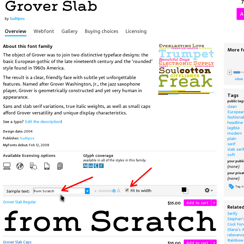
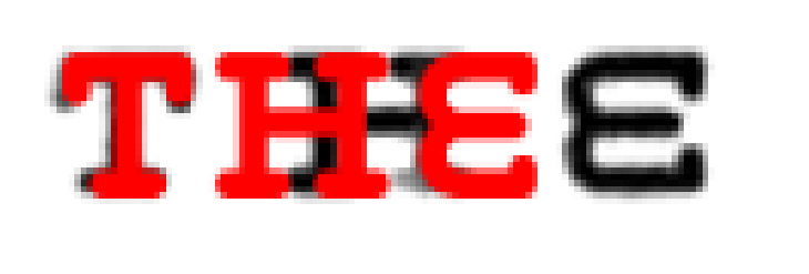
I started by entering the first word of our logo. “THE”
I then realized that the font used for this word was thicker than the rest. So I scrolled down to “Grover Slab Bold” and saved the sample image to my computer.

The image that is saved is an indexed gif image, and it has a small white border around the black text.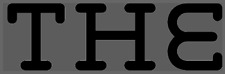
To be able to use this image we need to convert it to RGB and remove the white outline. I am using gimp in this tutorial, but the same options are available inside Photoshop as well. So first we will convert it RGB. (In Photoshop, the menu structure is exactly the same.)
Next we will remove the white outline using the “Color to Alpha” option. This will turn any white pixel into a completely transparent pixel. (In Photoshop, this takes a few more steps. Please see the mini tut at the bottom.)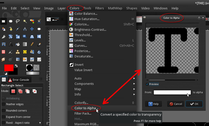
Now our text is ready to be sized and placed.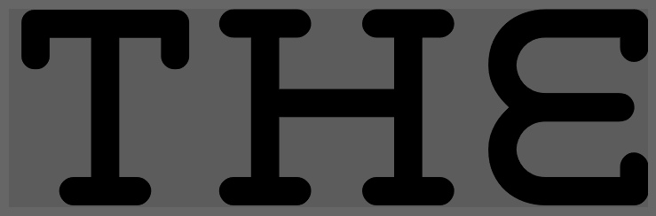
We will now add it to the low res logo we set up before so we can overlay this new sharper text over the old low res text. I colorized my text to red to make it easier to line up with the old text. As you can see, the kerning doesn’t match up properly though.
This isn’t a big deal so I just sliced up the individual letters and placed them separately.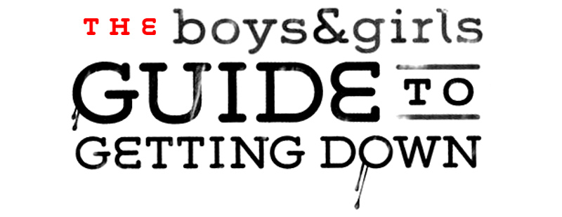
As you can see it can take a while to do a logo like our example with lots of text using different variations of the same font. You need to follow the previous steps for each word in the logo, matching the correct font, sizing it, and slicing up the letters to make them line up properly. The good thing about this logo is that all the variations of the font are from the same Family, so you can just choose the correct image from the results since it gives an image for every font in that Family.
Now to go back a bit and explain about having a logo with large fonts. Say your logo is something like “Guardian” and our font is Harlow. This will be a single line of text and will be wider than tall. If I enter this into the sample text box on MyFonts as one word, the image it produces isn’t large enough to use for an HDLogo. It’s only 720px wide and we need it to be 780px wide. Upsizing it is not an option.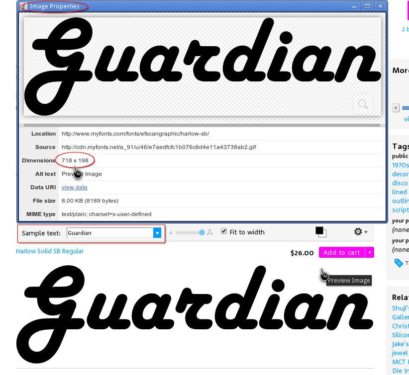
To make the text large enough to use for an HDLogo, we need to split the text into 2 samples. Like “Guard” & “dian“. Then both those samples will be close to 720px wide and combining them will give us a much bigger logo that we can down-size. Just something to keep in mind before you get ahead of yourself.
I’d like to say that using this technique is usually a last resort, but it is there for the people that really want a nice logo for something old and just can’t find a good enough source to be accepted on the site. This just shows you that you do not have to own every font, and there is always a way to get good results if you put your mind to it. It may not always be easy, but there is a way.
In closing I’d like to mention 2 more Font Sites that might come in handy.
Identifont is a site that gives you many ways to identify a font when samples just aren’t turning anything up. You can go through a series of questions about the font and even limit the questions to the letters you have. It also has a similar font engine that will show you other fonts with the same properties. A very handy site that has saved my hide more than once.
The last site is Typophile. More specifically, their Font ID forum. When all else fails, these guys deliver the goods. You will need to sign up for a free account to use the service, but once you are a member, it’s painfully easy to post an image there and have real pros help you to ID a font. I think it’s a good idea to do some searching yourself before asking there as a courtesy to not waste their time. They might even ask you what font matching services you tried before posting there. I’ve hit them with quite a few fonts that I just couldn’t match elsewhere and they’ve only been stumped once. Keep this link for when you are about to pull out your hair and you will probably be saved.
If you have any questions or anything to add, please post to our dedicated section in the forums to talk about fonts.
Appendix:
This is a mini tutorial to explain how to do “Color to Alpha” in Photoshop. This is one of the few options that gimp has that is not available in Photoshop, so we need to take a different approach.
1. Open the saved Indexed gif and convert to RGB as explained above.
2. Select the image. (Ctrl+A) or Select > All
3. Copy Image. (Ctrl+C) or Select > Copy
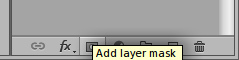
4. Add Mask. Select the image layer and click the mask icon in the layer toolbox menu. Or Layer > Layer Mask > Reveal All
5. Enter Layer Mask edit mode by Alt+L-Click on layer mask thumbnail.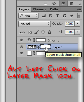
6. Now paste. (Ctrl+v) or Edit > Paste
7. Clear the selection (Ctrl+Shift+A) or Select > Deselect, and invert the mask by clicking the Invert button in the Mask Properties dialog.

8. Fill the main image with black. Make sure your Foreground color is black then select the main image thumbnail and (Alt+Backspace) or Edit > Fill > Foreground Color
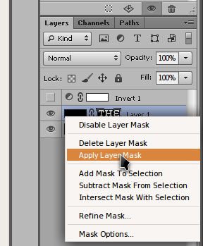
9. Apply the Layer Mask by R-Clicking on the Layer Mask Thumbnail and select Apply Layer Mask. Or, Layer > Layer Mask > Apply
10. You are done! You should have a perfect image without the white outline now.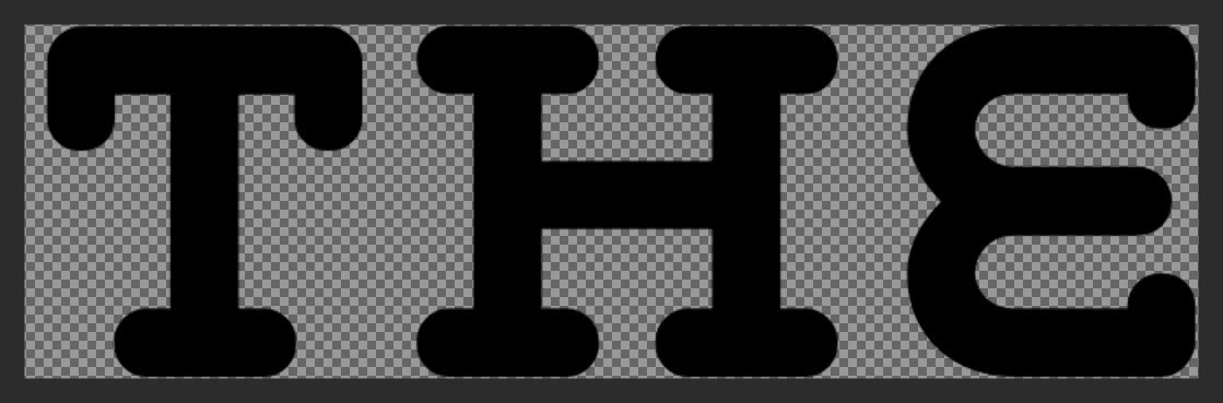
As you can see, this is quite involved when compared to the Color to Alpha option in gimp. Unfortunately this is the only way I have found so far to give the same exacting results that gimp gives. I am not a Photoshop user and would love to update this with a shorter procedure if one exists. If you know of a shorter way to give the same results, please contact me so I can verify it and I’ll replace this mini tutorial. I will also offer 200 contributor points should it meet all the requirements.
*Note*I just happened across a free Photoshop Plugin that does this perfectly. It’s part of a 8 filter pack and is called AlphaWorks. Unfortunately it’s still not the equivalent to gimp as it only works for the colors Black and White, but that fits the needs of this tutorial.
Very Nice!!!
Thanks @Simche! This one took a while to complete.