Why Your Artwork May Be Denied

Description:
This is more a reference page than a tutorial for explaining the most common reasons we deny artwork on the site. The image examples should help you identify the problem you may be having and then you should be able to look in out tutorial section to learn how to fix it. **TEMPLATES FOR IMAGES**
LOGOS:
Jagged edges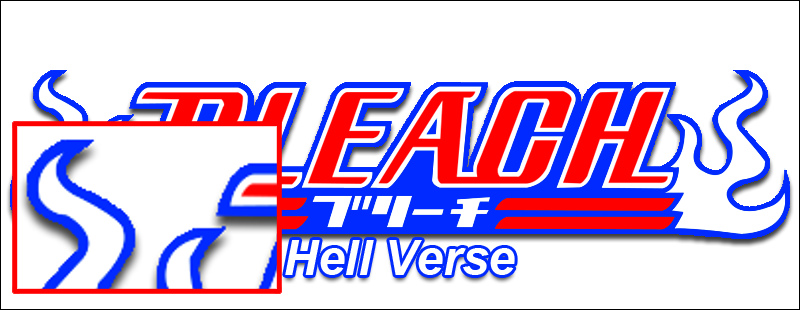
The edges are very pixelated and not as smooth as they should be. Fix: The best way to prevent this is to render images using the path/pen tools and make sure you have anti-aliasing turned on. If you are erasing the background instead, make sure to use a fuzzy brush instead of one with a hard edge. This will leave your edges a lot smoother.
Related Tutorials:GIMP FROM SCRATCH – PART 4 (INTRO TO PATHS AND CREATE HDCLEARLOGO)
GIMP HDLOGO
GIMP CLEARART TUTORIAL
THE ANIMAL LOGO TUTORIAL
Wrong Size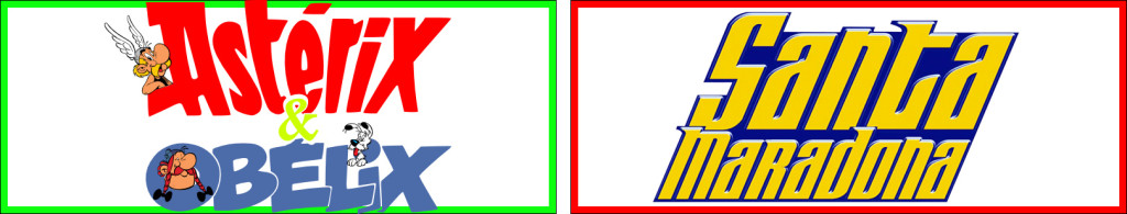
The left image has no gutter at all where as the right one has a gutter which is too big. The left image also doesn’t have a shadow, but we’ll get to that. The gutter is 10px all around and only shadow and glow is allowed there, however the logo must still fill all the way out to the beginning of the gutter unless the shadow/glow exceedes 10px. Fix: Simply resize the logo.
Related Tutorials:HOW TO CORRECTLY SIZE AND CENTER LOGOS IN PHOTOSHOP
HOW TO SIZE AND CENTER HDLOGOS IN GIMP
Not visible on all backgrounds

The left image looks great on black and inversely the right on white. A standard Drop Shadow would fix the left image, but the right image requires either a white Drop Shadow, or more preferably a thin white stroke. A white glow could also be used. The point is to never forget that these logos are going to be displayed against all types of backgrounds and you must be able to clearly see it on all of them. Fix: Add a shadow, stroke or glow to your logo if needed
Cropped shadow/glow
The logos drop shadow is cropped at the bottom. Fix: If you have a shadow this big you’ll have to downsize the logo so the shadow no longer gets cropped. Same goes for glows.
Related Tutorials:HOW TO CORRECTLY SIZE AND CENTER LOGOS IN PHOTOSHOP
HOW TO SIZE AND CENTER HDLOGOS IN GIMP
Blurry logo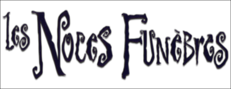
The image is very blurry and overall low quality. Fix: Find a higher quality source.
Not center aligned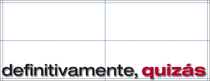
An otherwise perfectly good logo that hasn’t been center aligned Horizontally, or Vertically. Fix: Center align it.
Related Tutorials:HOW TO CORRECTLY SIZE AND CENTER LOGOS IN PHOTOSHOP
HOW TO SIZE AND CENTER HDLOGOS IN GIMP
Grainy color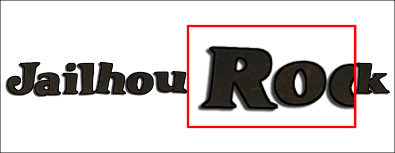
This logo has some very grainy colors, perhaps from being cut out of a scanned poster.Fix: Recolor it. You could also just use a color overlay under Blending options (PS)
Related Tutorials:GIMP FROM SCRATCH – PART 4 (INTRO TO PATHS AND CREATE HDCLEARLOGO)
GIMP HDLOGO
THE ANIMAL LOGO TUTORIAL
CLEARARTS:
No logo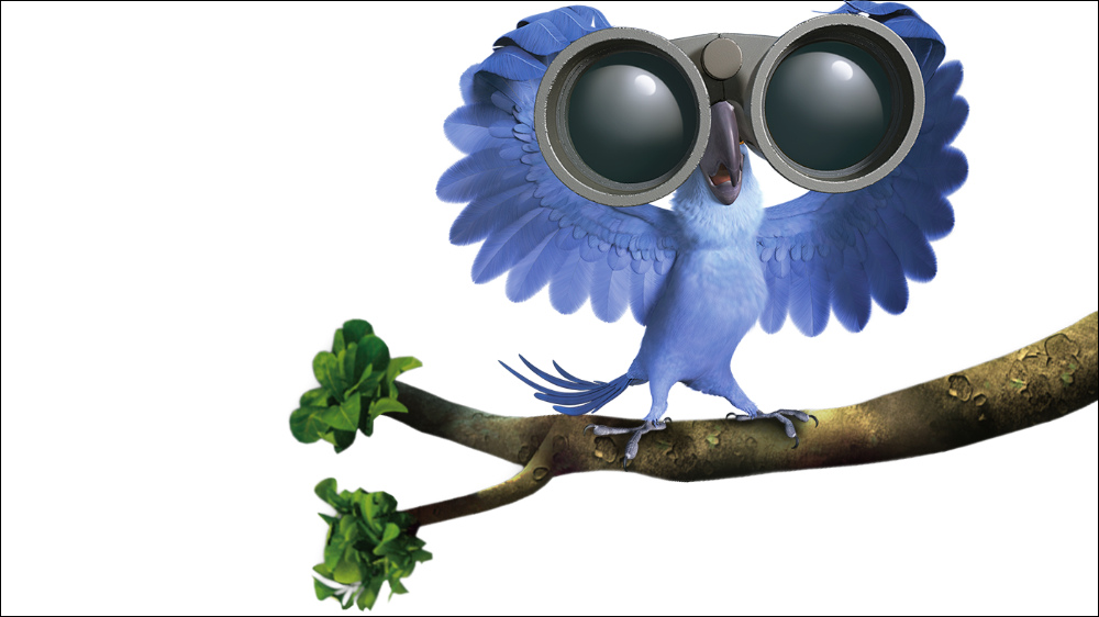
A very nice clearart that only needs a logo to be complete Fix: Add logo. Look in the movie’s section for a logo to download and apply.
Background Bleed Through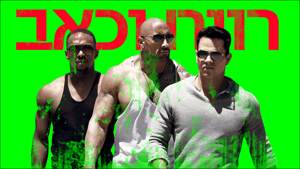
Good looking clearart, but only on the one color it was extracted from. Someone turned the background color to alpha and didn’t check it against different color backgrounds. Fix: Use the pen/path tool or masking to remove the background.
Related Tutorials:GIMP FROM SCRATCH – PART 5 (RENDER IMAGE ANDCREATE HDCLEARART)
GIMP CLEARART TUTORIAL
Tagline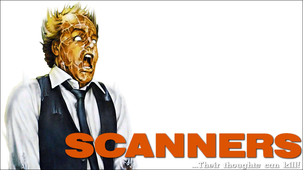
Great clearart but taglines are not allowed. Fix: Remove tagline and this is perfect.
Cropped Shadow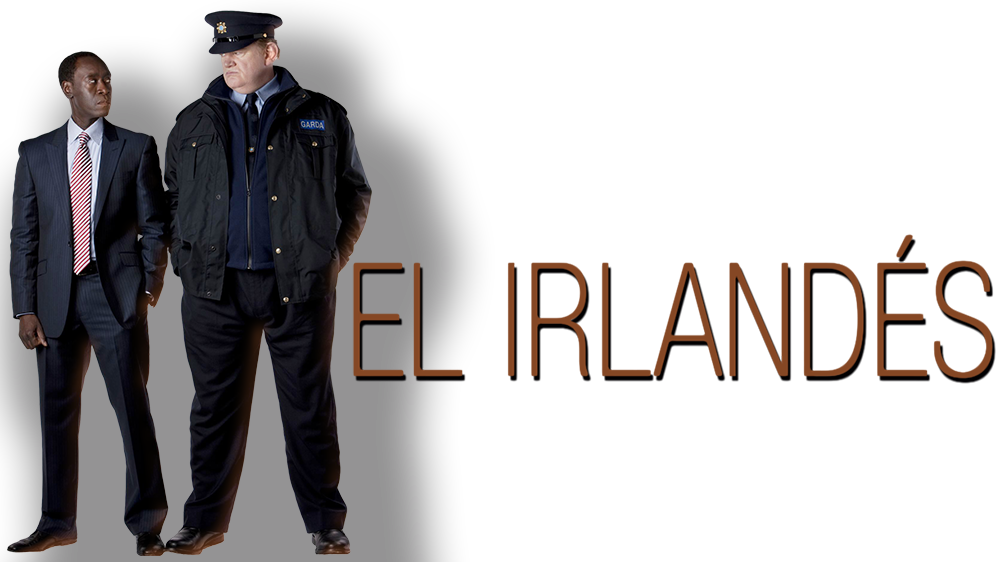
(Cropped shadows on the bottom or right edges could be denied if they are not necessary.)
Shadow is cropped on the left and bottom edges. As per the rules, no cropping is allowed on to top or left edges, but… You should only really crop a shadow if the image is cropped as well. When an image is not cropped, you should try to not crop a shadow on any edge. Fix: Either reduce the shadow size to not be cropped, or move the image and shadow to the right until there is no cropping on the left edge.
Related Tutorials: Check out the video at the bottom of this post to learn how to check your own work.
Not Rendered Completely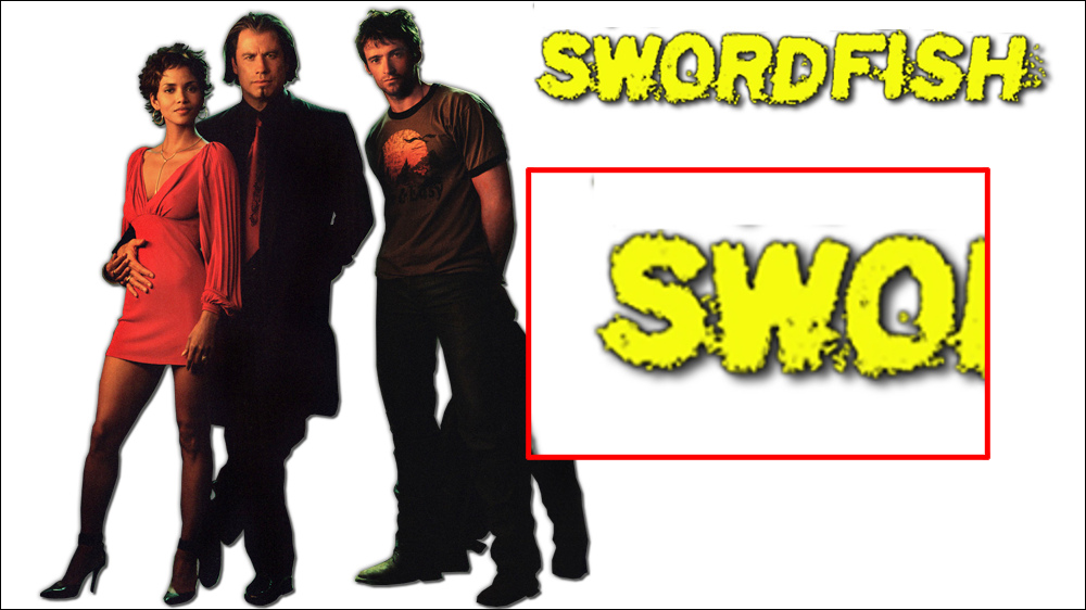
When you render an image or a logo with the erase tool, color to alpha, or a mask, there is always the possibility of not removing all the pixels outside of the main subject. This is the reason we ask that you check your art against different colored backgrounds in the rules. If you are not rendering hair or other very fine details, you should always use the path/pen tool to get crisp clean edges every time. Otherwise, you need to be diligent in checking your own work for these stray pixels. One way is to add a stroke and this will highlight any small pixels that are hard to see. Once you have found and erased them, you can remove the stroke. Fix: Finish rendering (cut out) the logo and erase the extra pixels near the logo.
Related Tutorials: Check out the video at the bottom of this post to learn how to check your own work.
Aspect Ratio
The aspect ratio of the image was not kept intact. Fix: Do not squish you images in any direction. Make sure your aspect ratio is locked when resizing an image
Related Tutorials:(This tutorial is aimed at posters, but the Aspect Ratio portion applies here.) POSTER CREATION BASICS (GIMP & PHOTOSHOP)
POSTERS:
*note* Posters are shown against a bigger canvas so the edges can be seen clearly. This “gutter” is not used in the actual image, and is just shown here so you understand how we check them.
Low Quality

Image is just not of high enough resolution. Also has some stray pixels. Fix: Find a better image to start with.
Text Not Covered Properly
Text is showing through where it was supposed to be covered up. Fix: In this case a small black level adjustment fixed it. You could also just paint over it as well as long as it’s blended properly.
Related Tutorials:ADJUSTING COLOR LEVELS
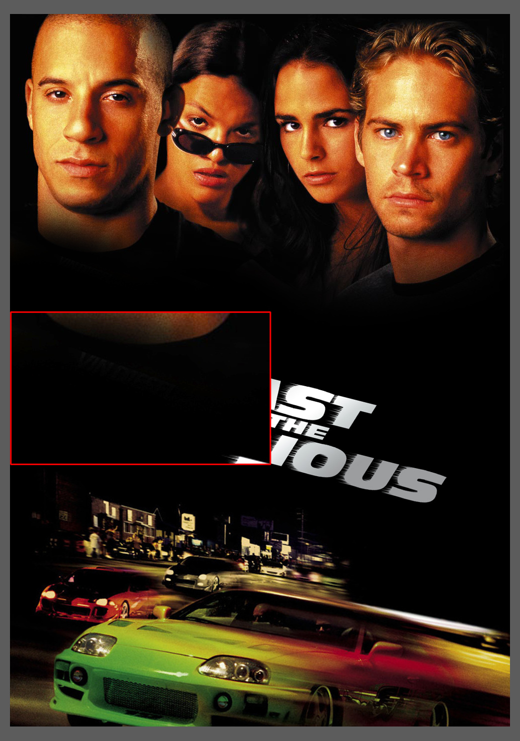
Non Permitted Text
As per the rules. Only Logos are allowed on posters. Fix: Use the clone/stamp tool to cover up the unwanted text. A little level adjustment also helps.
Related Tutorials:POSTER CREATION BASICS (GIMP & PHOTOSHOP)
Compression Artifacts
Blocky compression artifacts. Especially around the markers of the clock. Fix: Sometimes these can’t be fixed without finding a better image or some creative smoothing and sharpening.
Related Tutorials:POSTER CREATION BASICSADJUSTING COLOR LEVELS
Crop Lines
Another great image but there is a white line down the right side. This is easy to miss if you don’t check your poster edges against different color backgrounds. Fix: You could either recrop & resize the image, or use the clone tool along the edge if the image isn’t big enough to crop any further.
Related Tutorials:CHECKING IMAGE EDGES Check out the video at the bottom of this post to learn how to check your own work.
Covered Text not Blended Properly

You can clearly see where text or other elements were covered with a black brush, but the black doesn’t match the image. (It is important that you can see this clearly. If not, it means you need to adjust your monitor properly.) Fix: Again a little level adjustment to the rescue. If leveling doesn’t help, you should use the clone tool or use the color picker to select the paint color from the surrounding area you want to cover.
Related Tutorials:POSTER CREATION BASICSADJUSTING COLOR LEVELSCALIBRATE YOUR MONITOR
Comments are closed.